So Much (For) Stardust
Project Objective
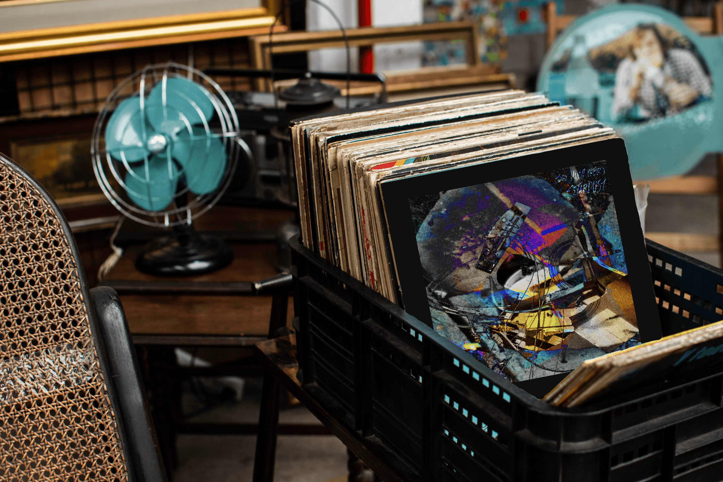
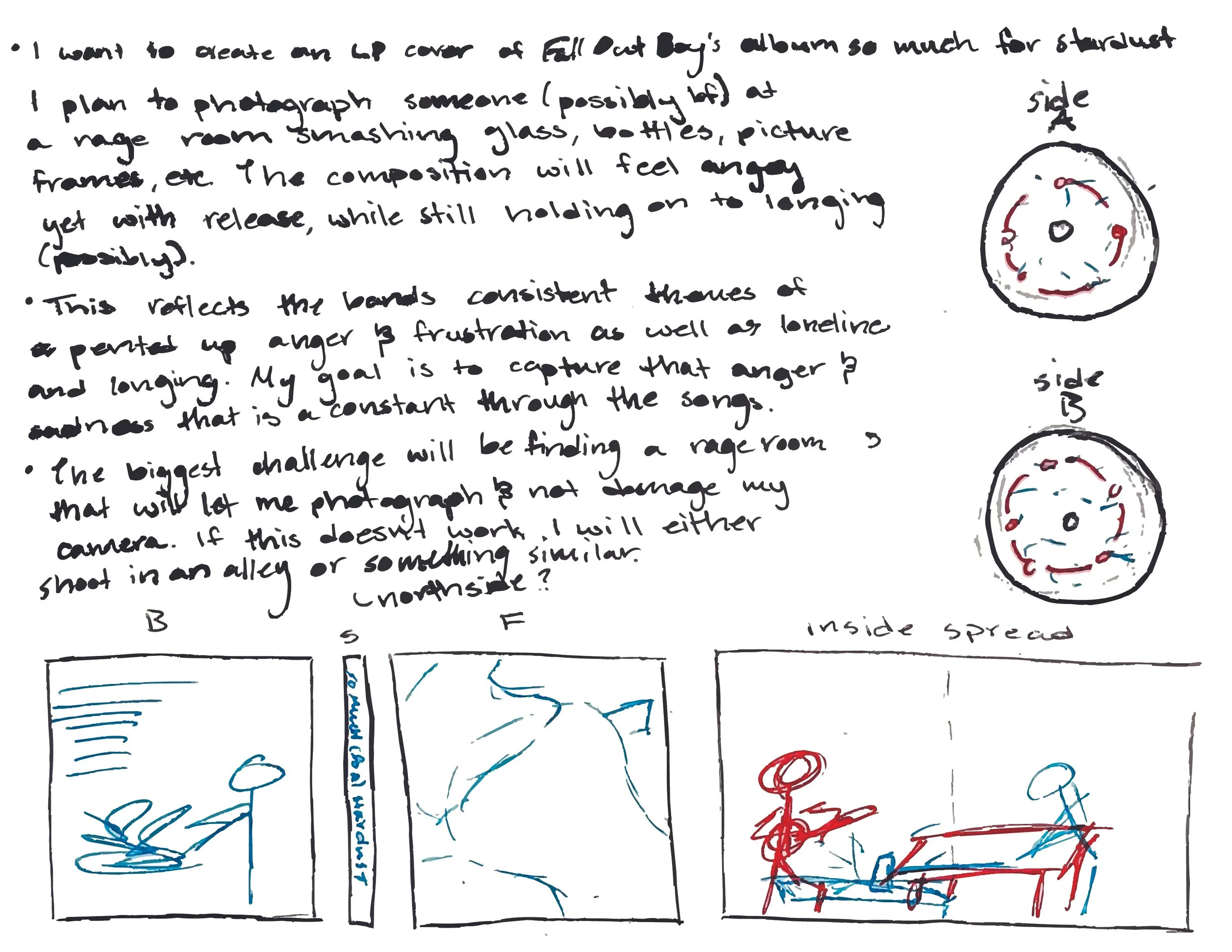
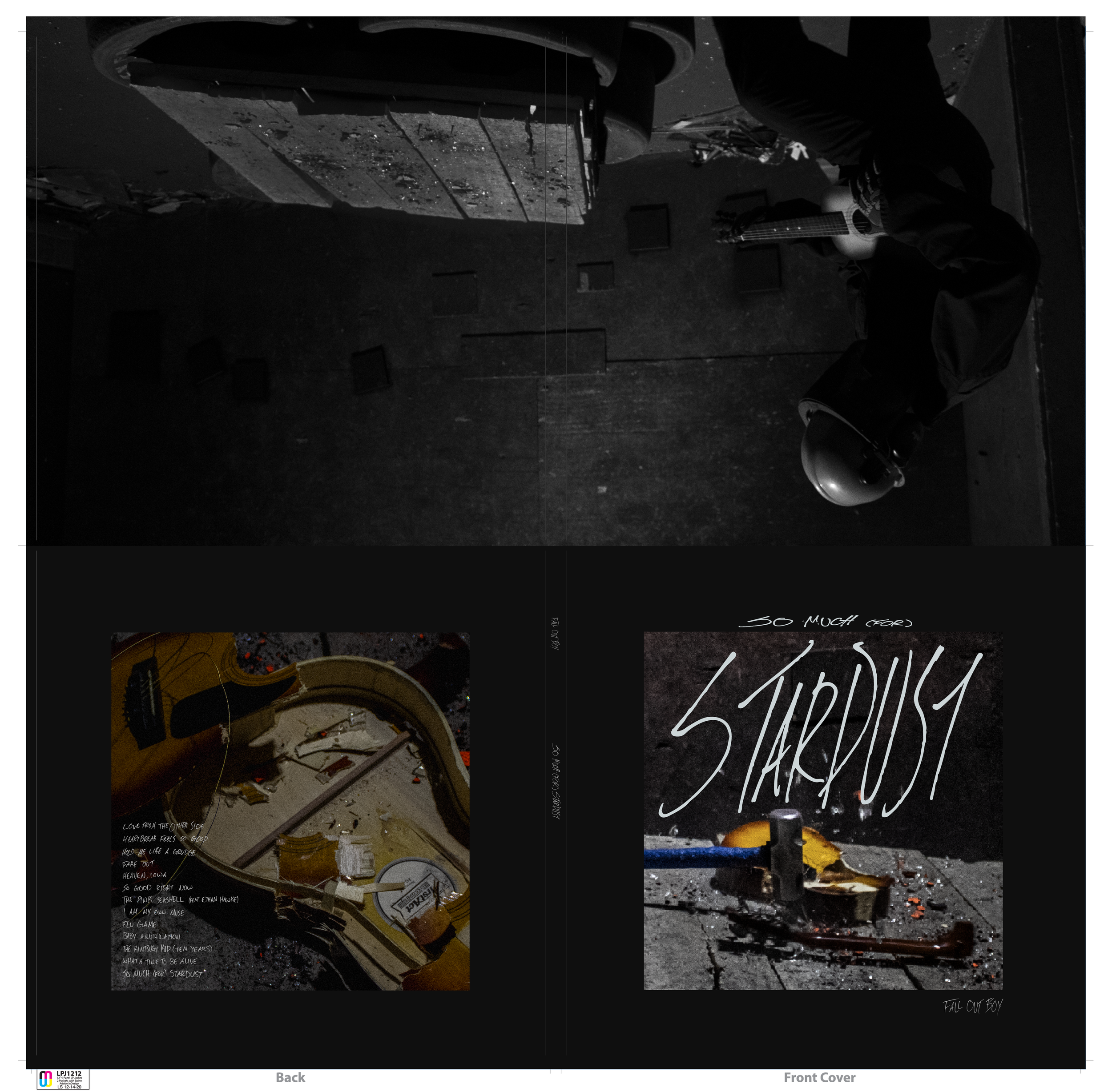
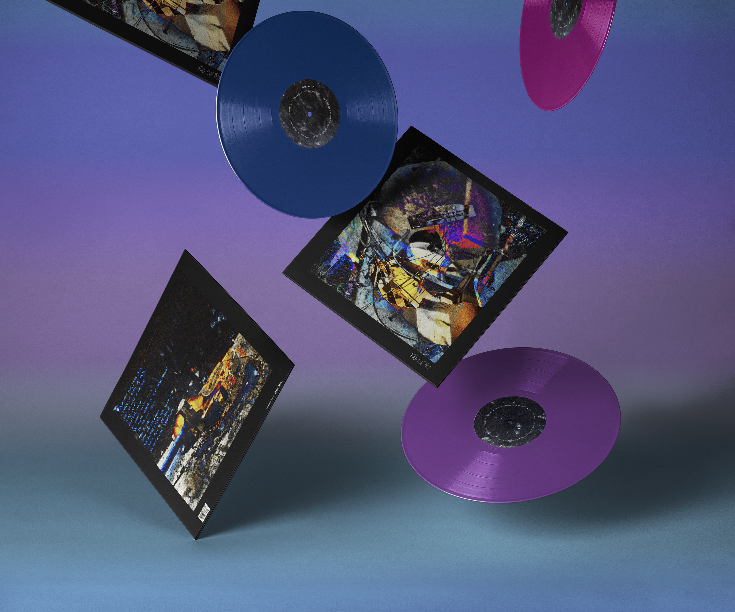
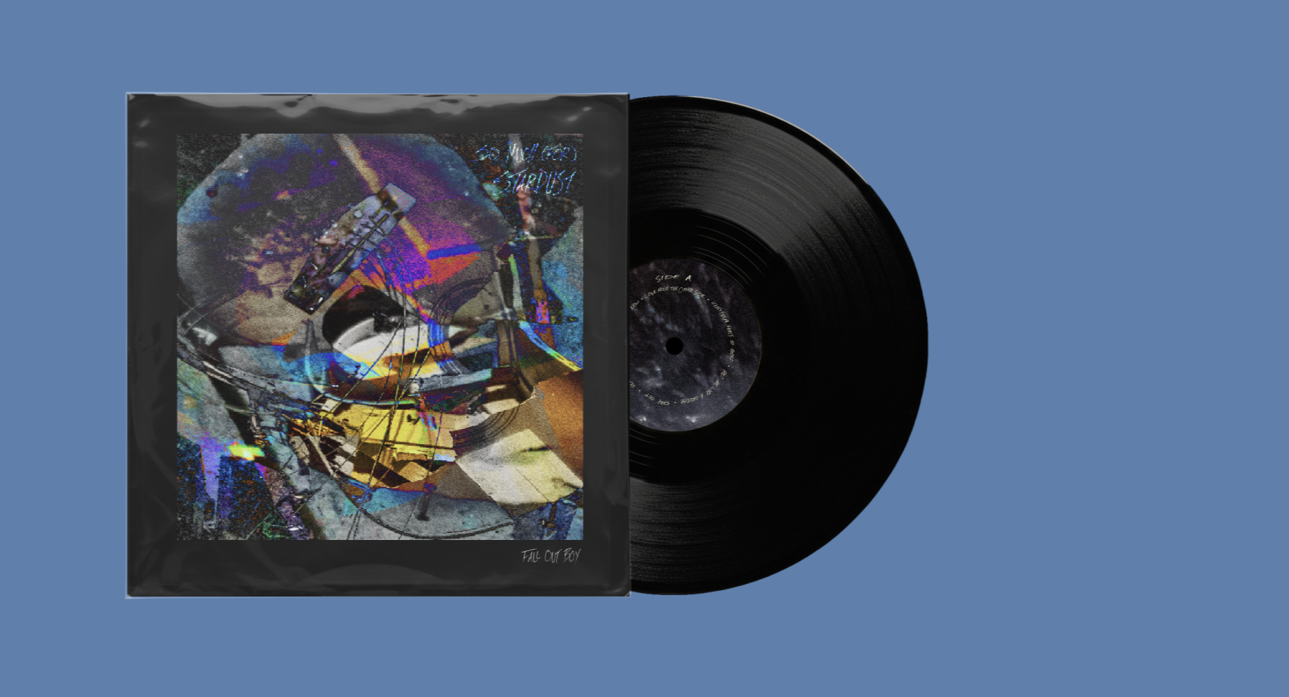
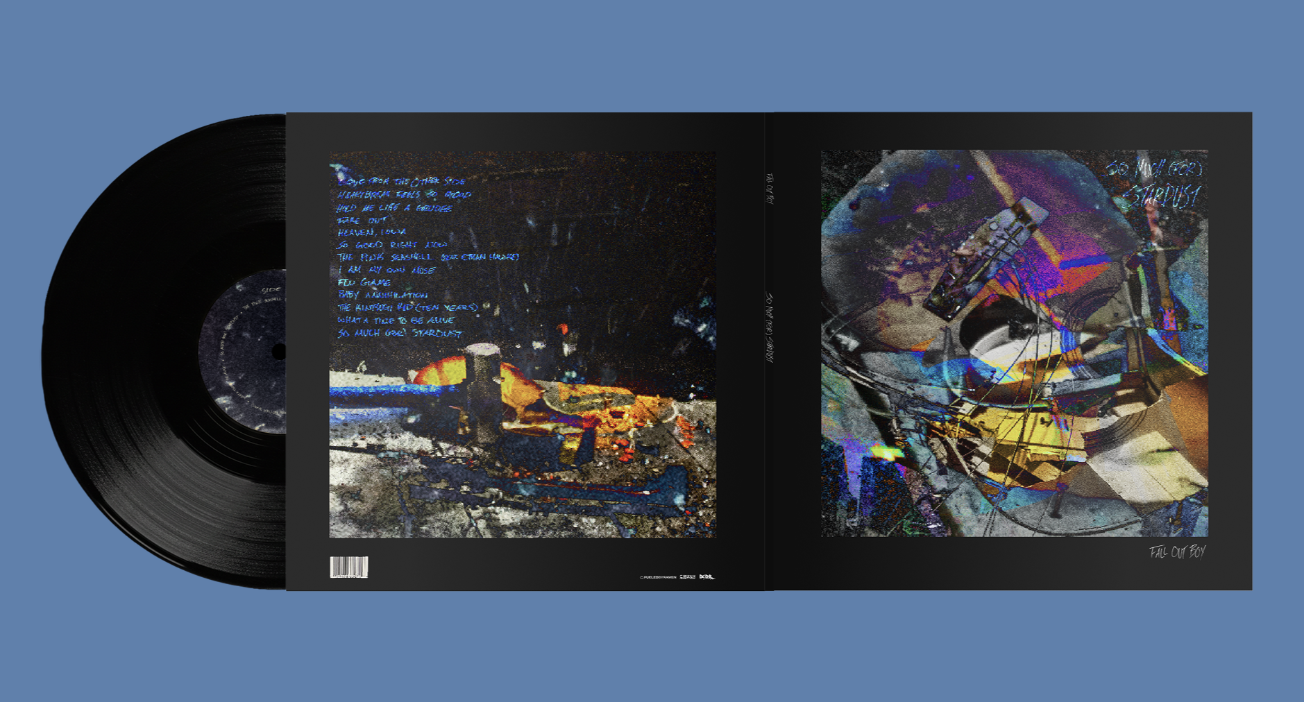
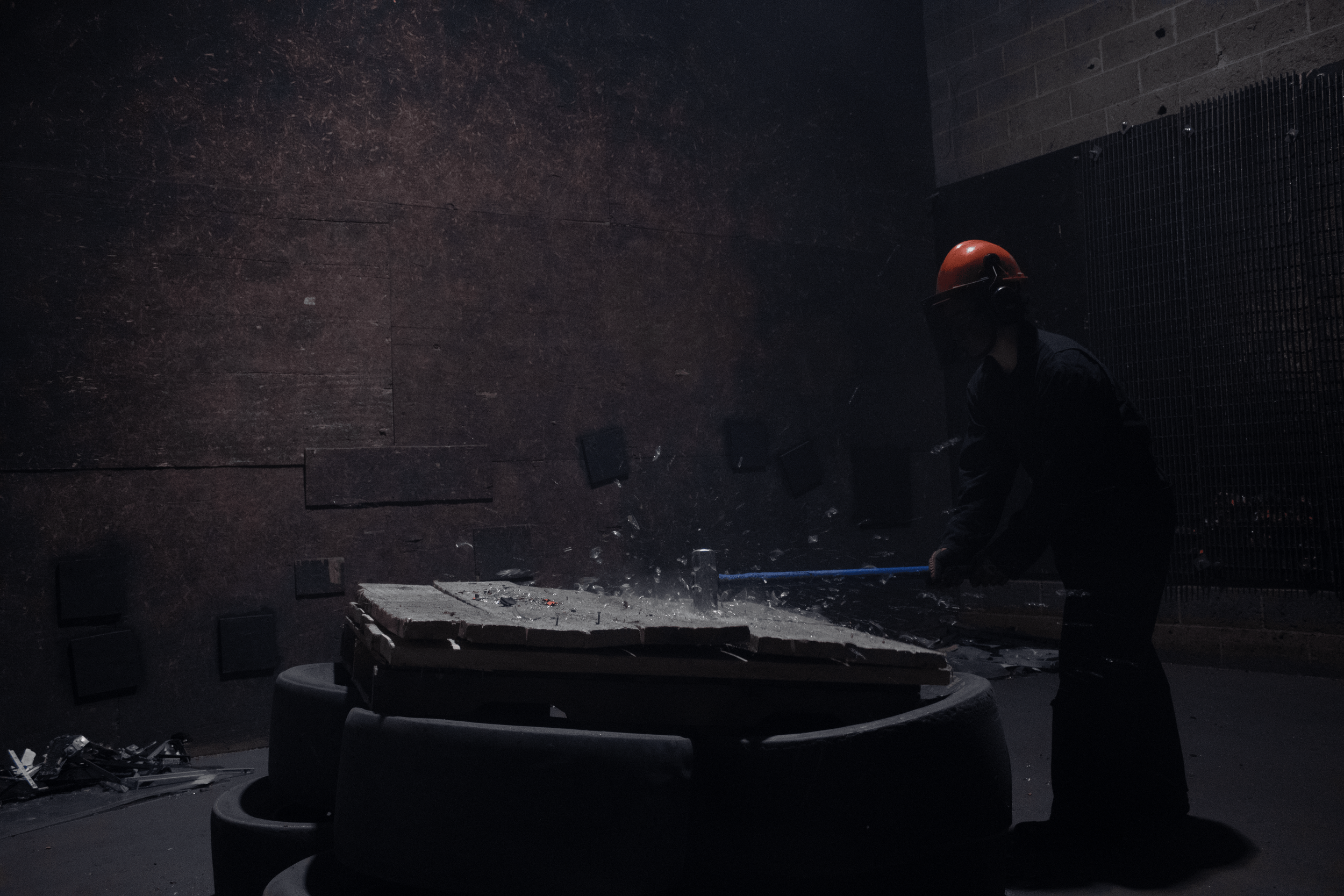
Reimagine the visual identity of an existing album using photography as the primary design element. The project required designing a new front and back album cover as well as custom vinyl record stickers for both sides. The design needed to capture the tone and themes of the music while presenting a fresh and cohesive visual interpretation.
For this project, I selected So Much (for) Stardust by Fall Out Boy as the foundation for the redesign.
Sketches
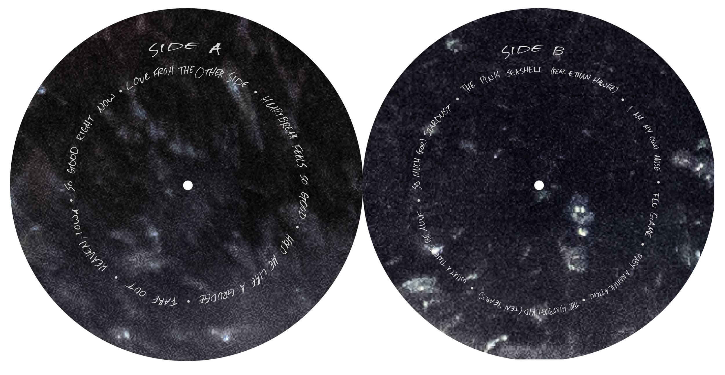
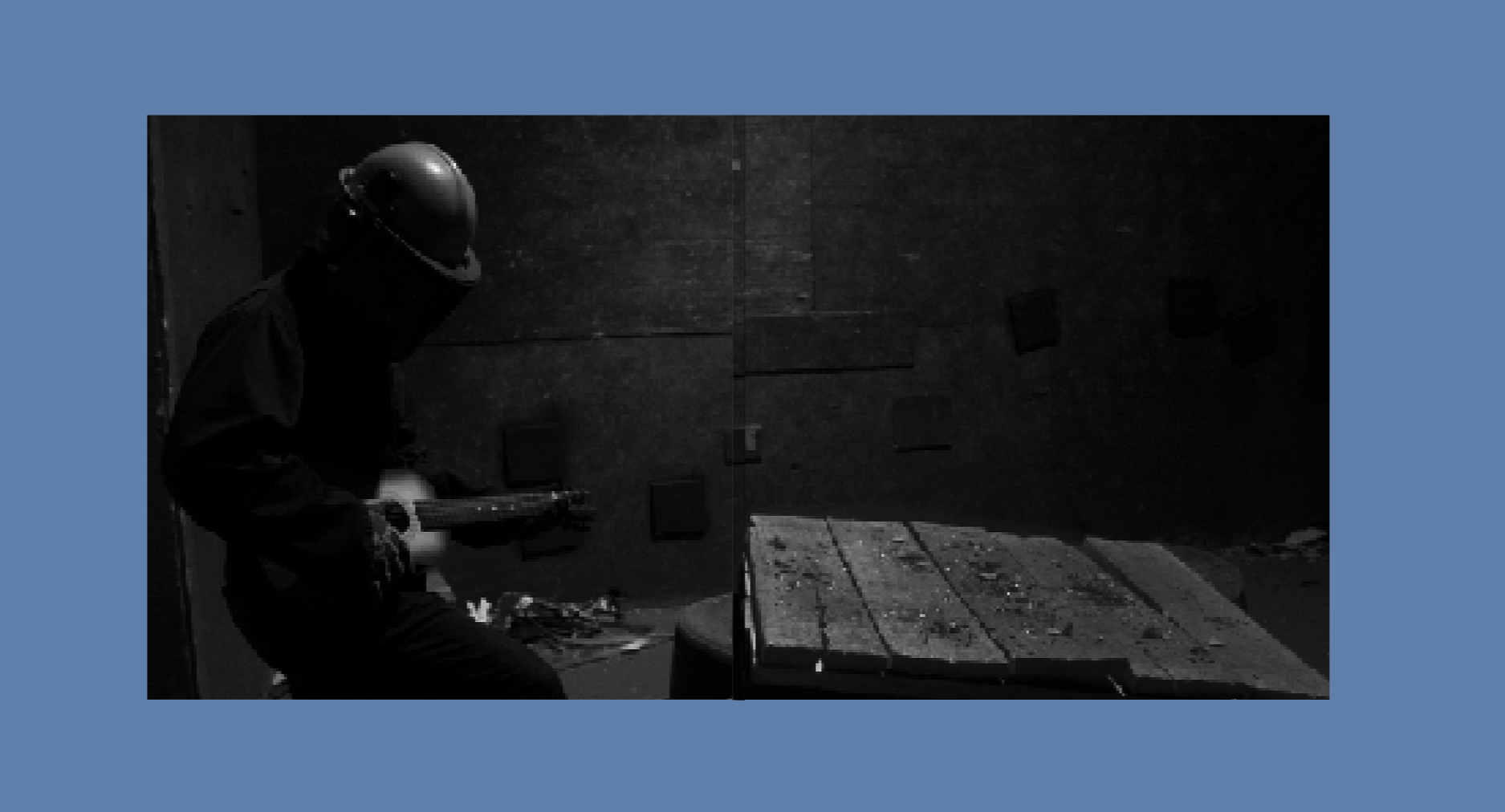
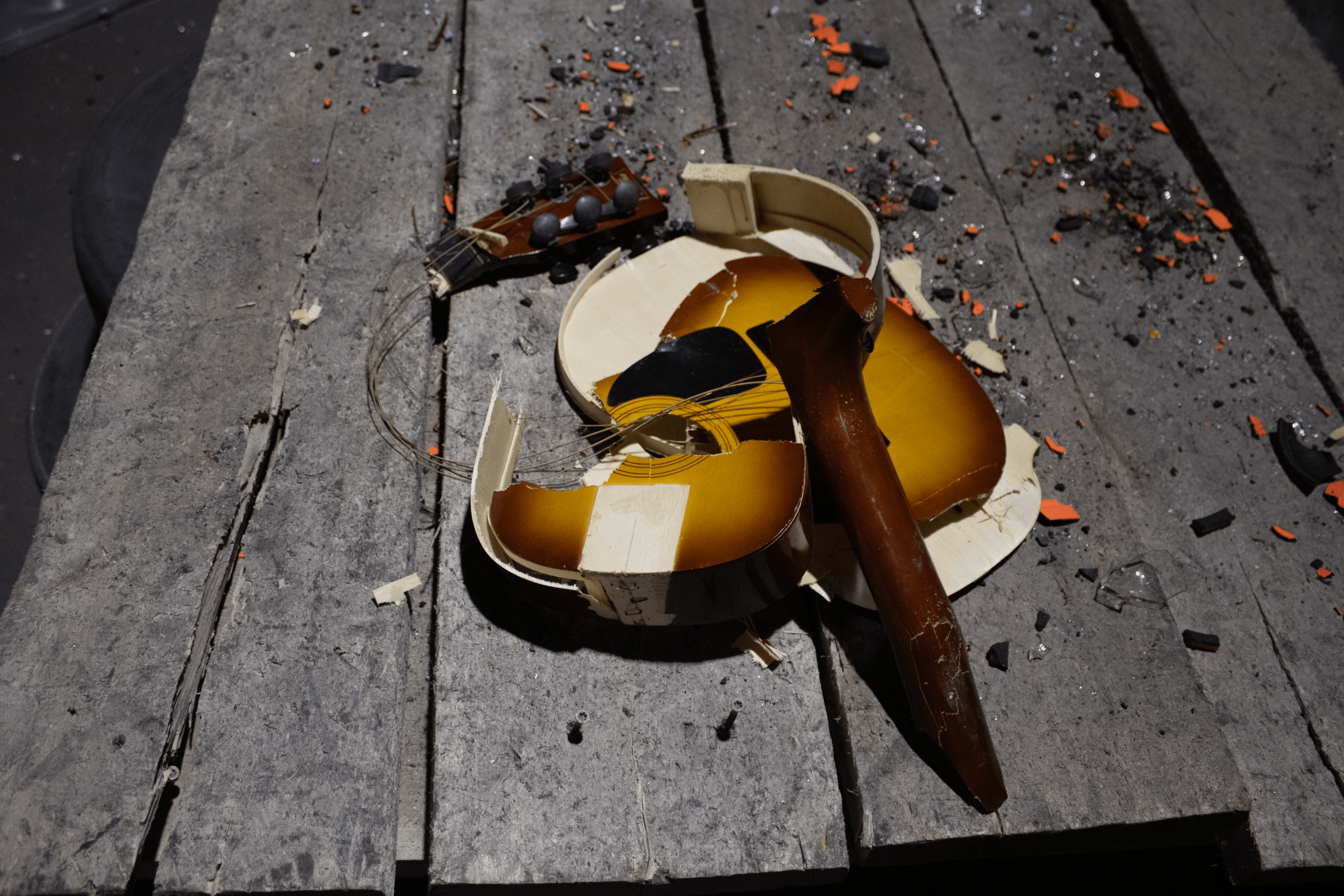
Core Photographs

Ideation/Iteration
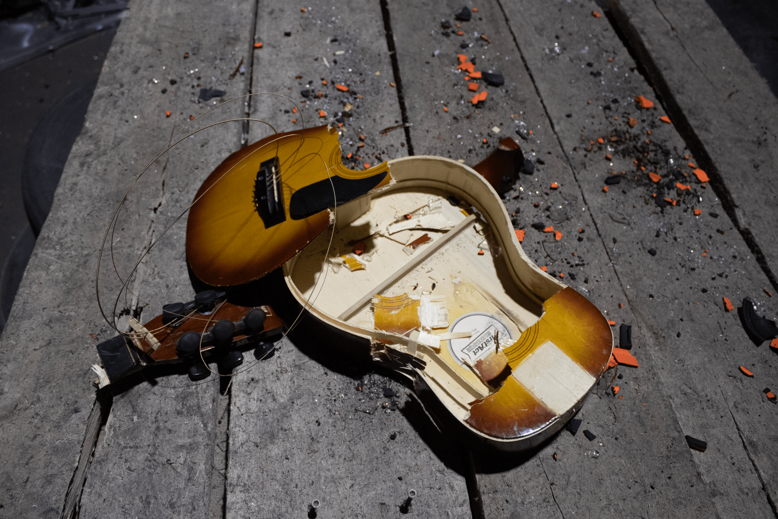
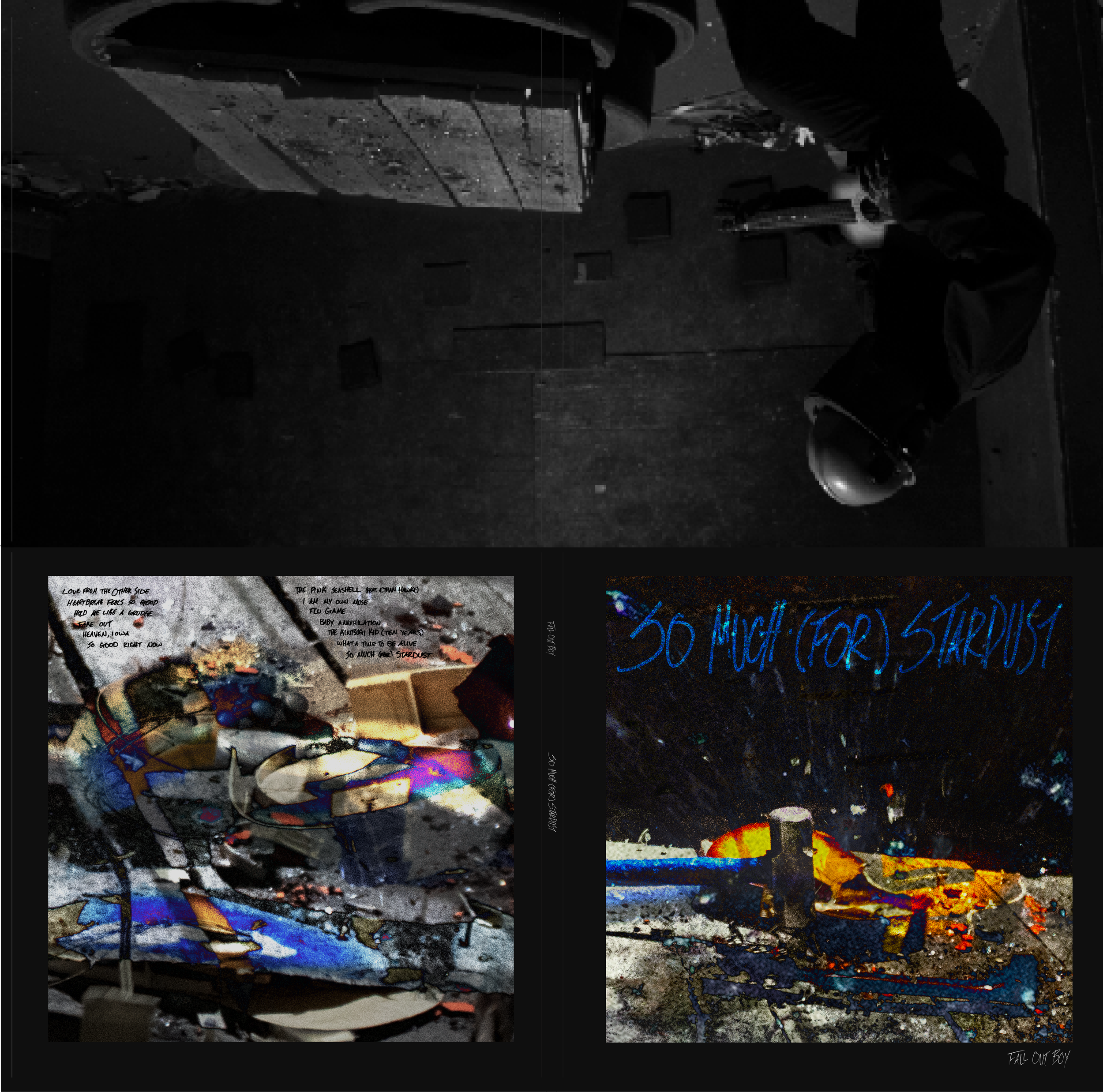
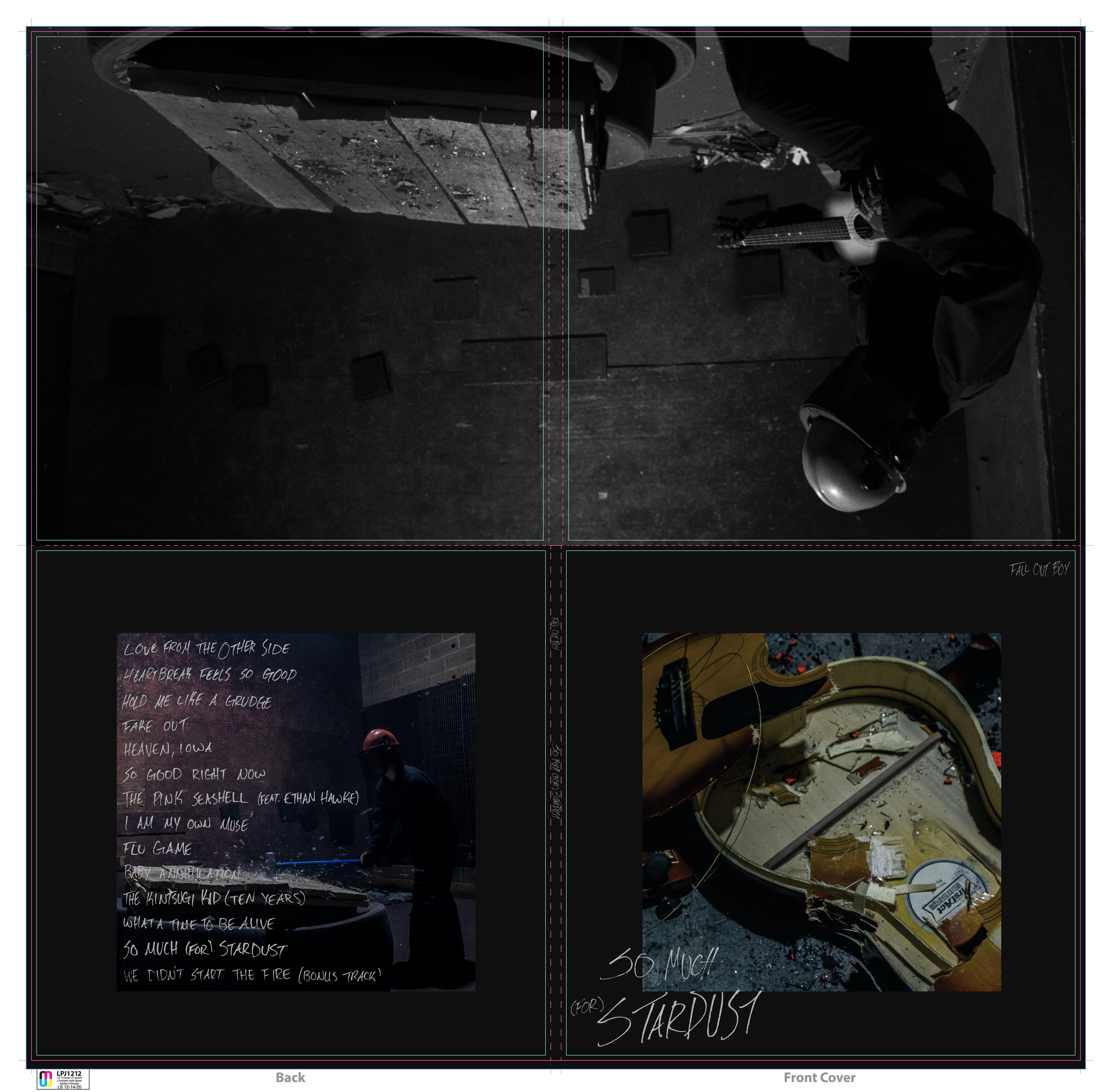
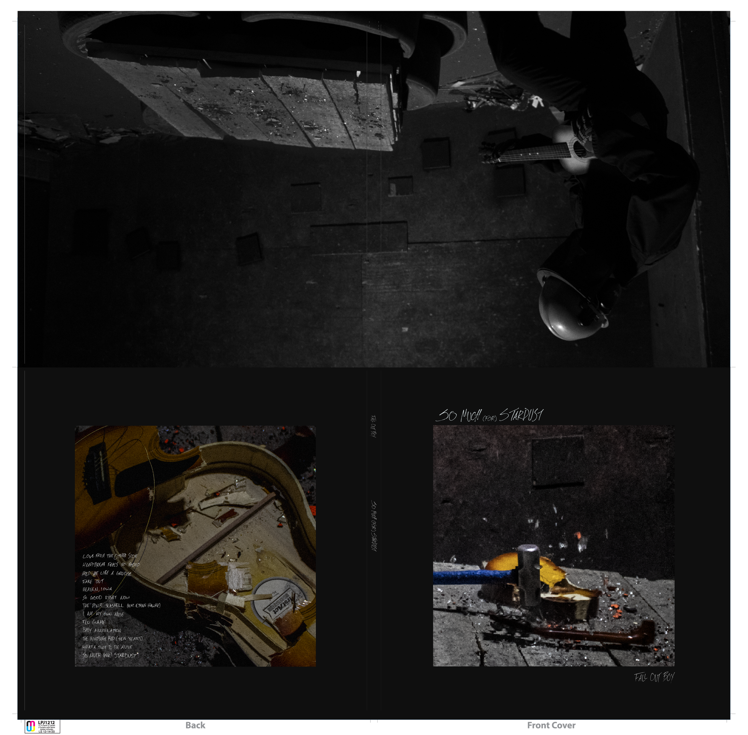
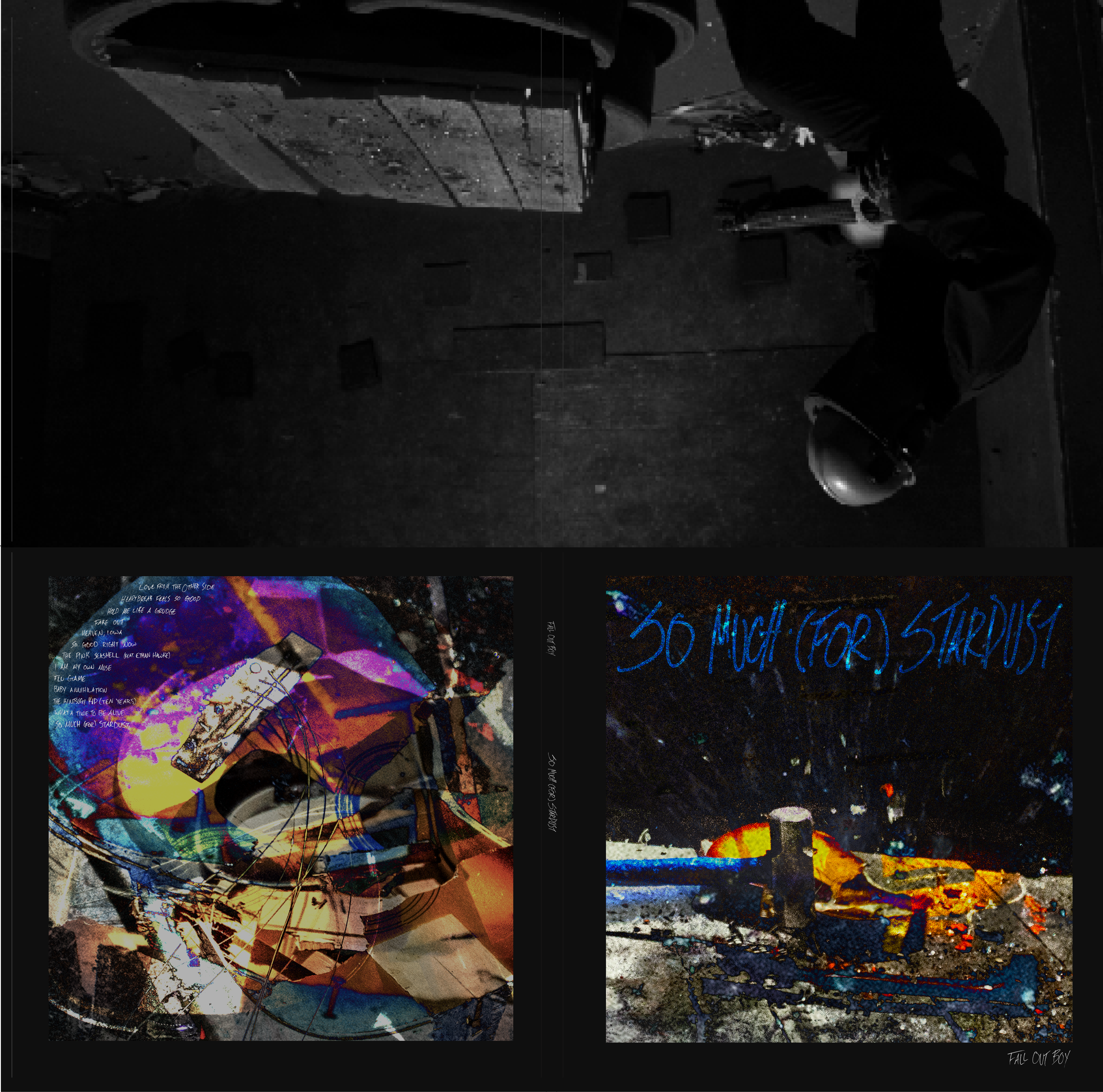
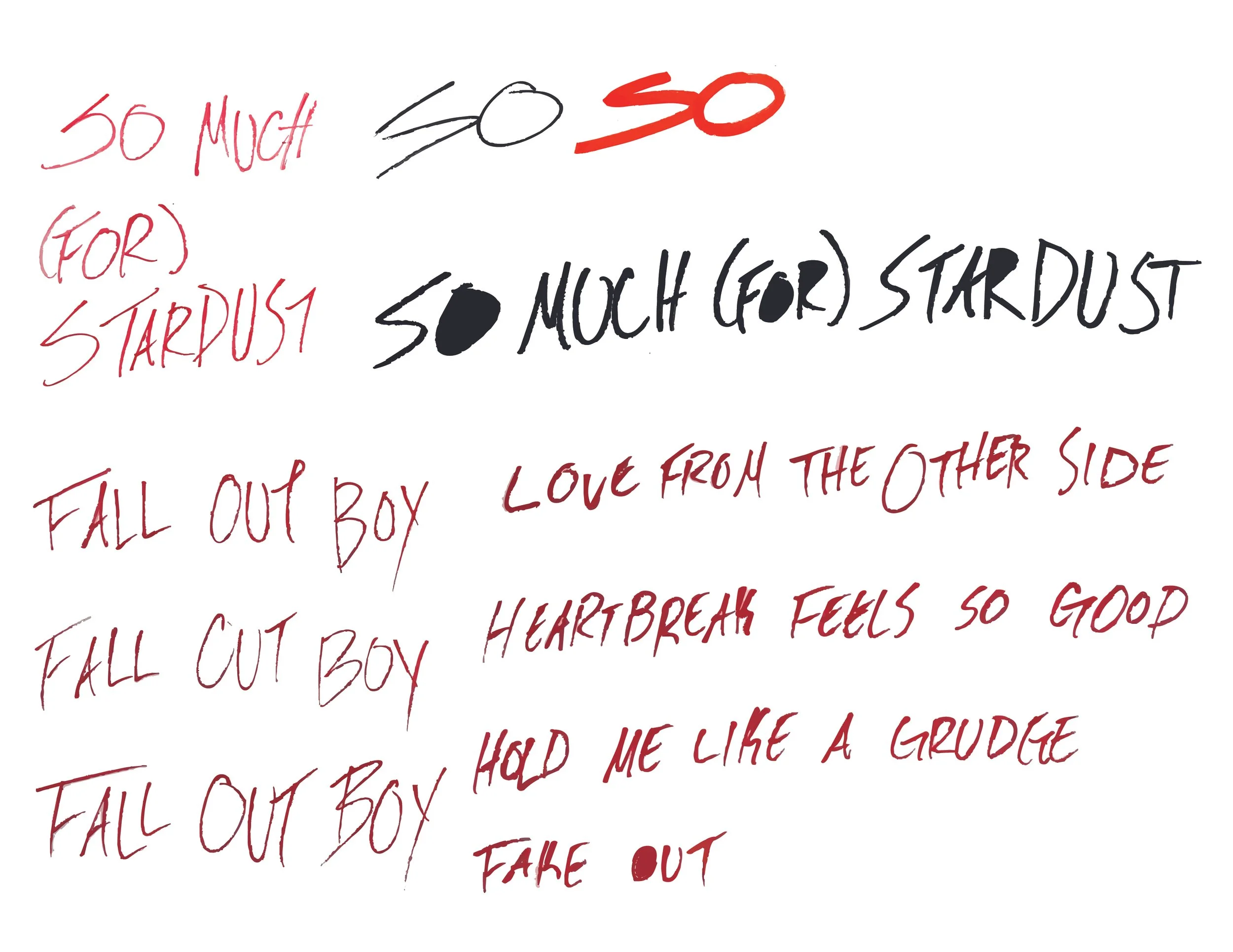
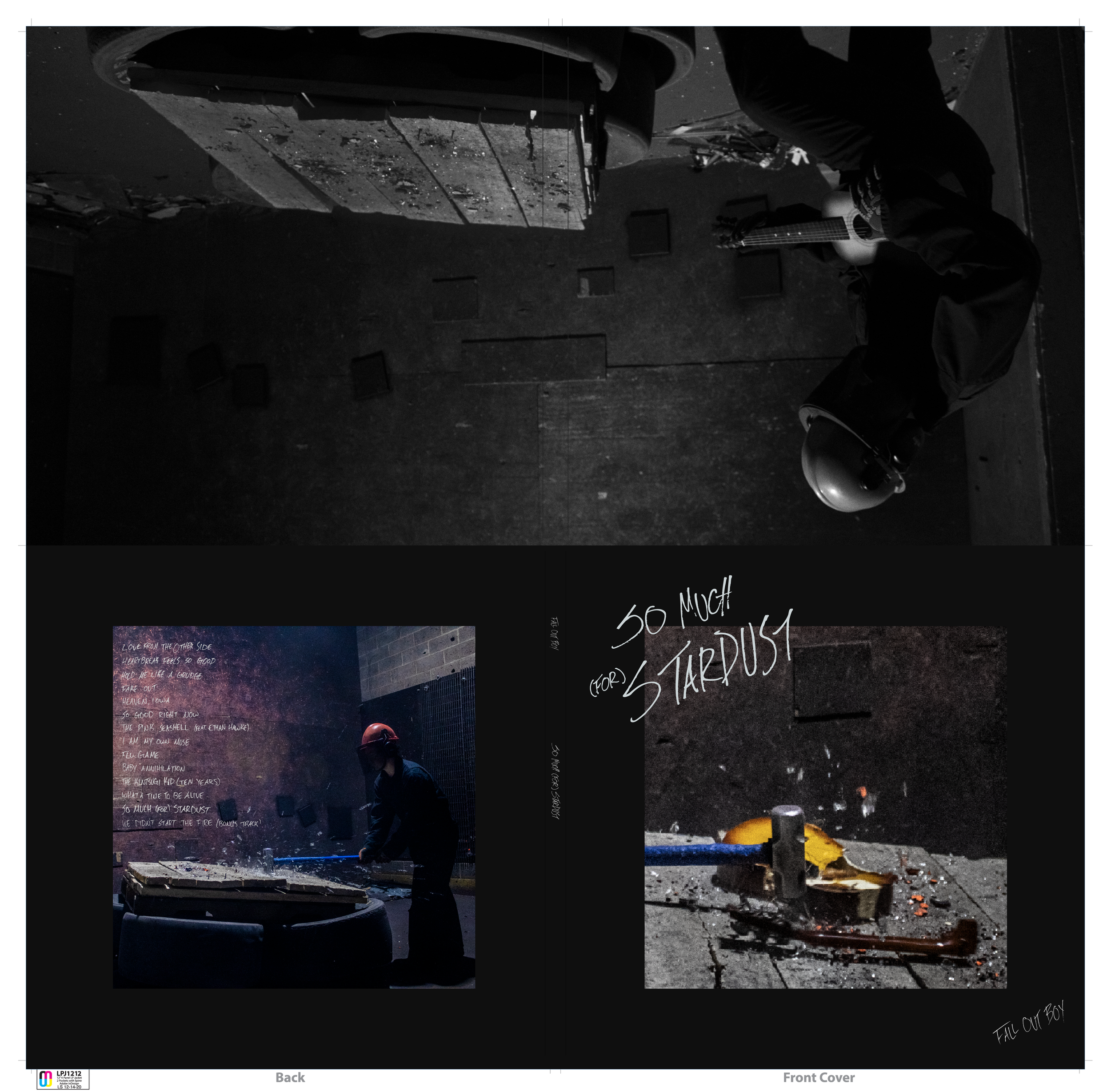
Throughout the photography application process, I played with the typography application, whether the photograph of the guitar would fit best on the front or back cover, as well as overlaying photos and adding a range of blending modes (ie: hue, saturation, soft light, color).
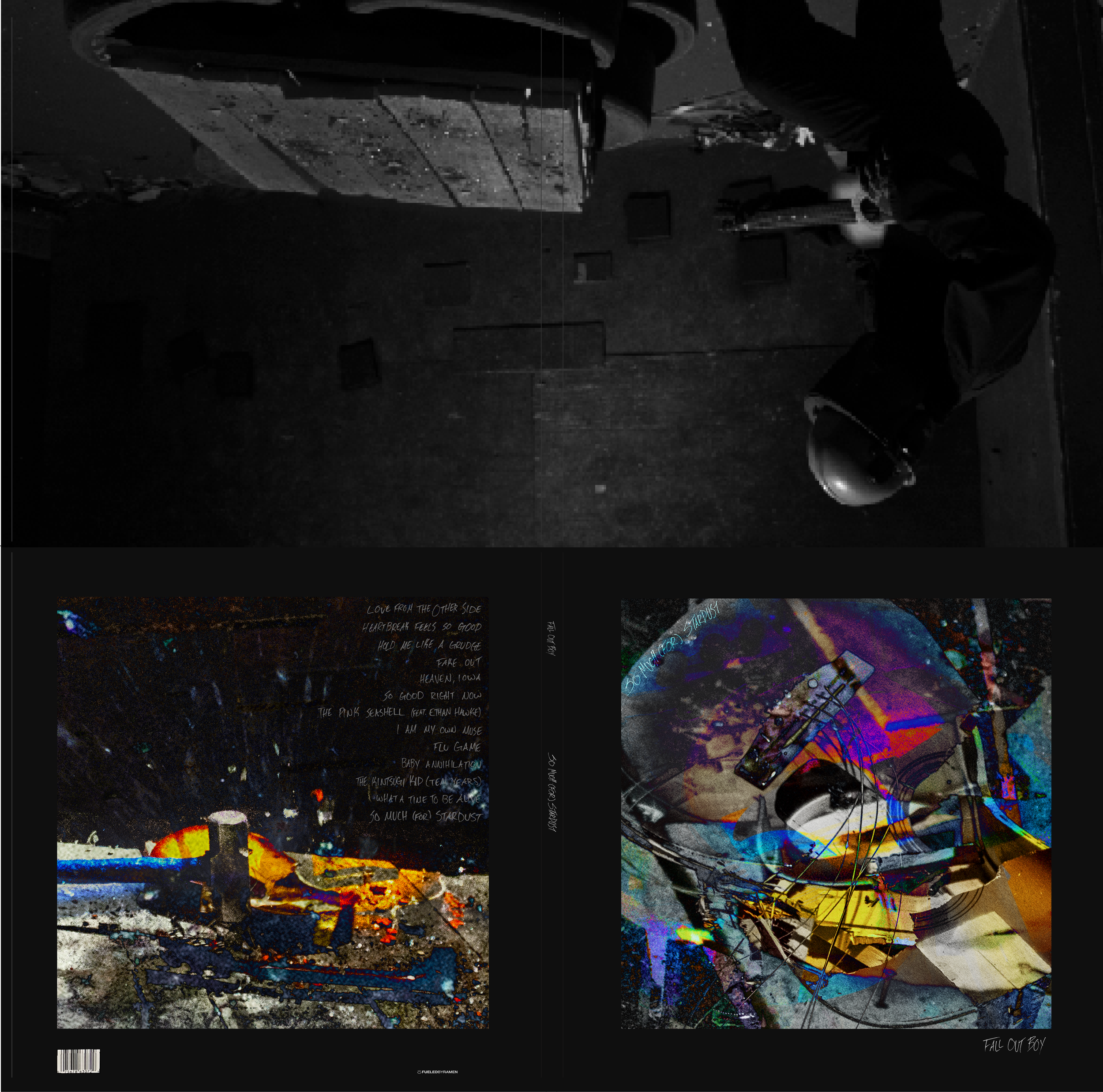
Final Version
My final design was selected as 1 of 12 pieces to be displayed at Shake It Records. The work was chosen by a panel of judges including the shop’s three owners, photographer and professor Madeleine Hordinski, and Jacob Moscovitch from New York Magazine.