Tablet & Ticket
Project Objective
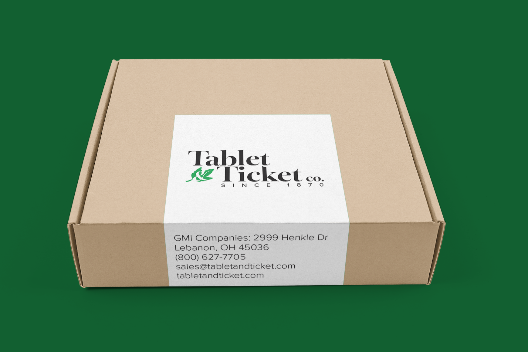
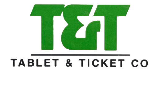
Tablet & Ticket is a custom display case company that has been around for almost 150 years. Recently, manufacturing operations moved to Ghent’s facility, while the company maintained its independent brand identity.
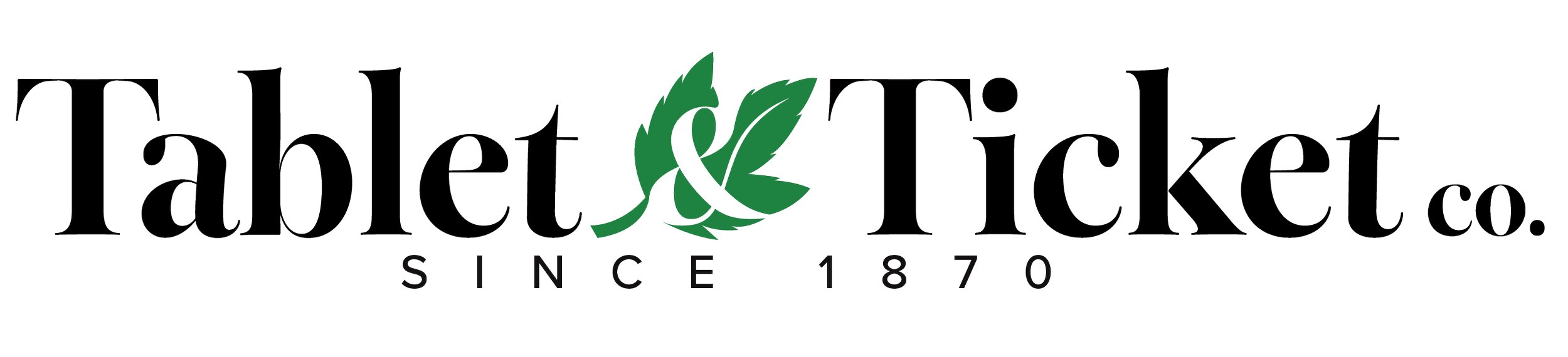
I was tasked with redesigning the logo to create a more modern and refined identity while maintaining a connection to the company’s heritage. The mark needed to function both independently and alongside the Ghent brand should a full merger occur. It also had to reflect the company’s architectural focus and stand out within a competitive landscape dominated by simple sans-serif wordmarks and multi-color logos.
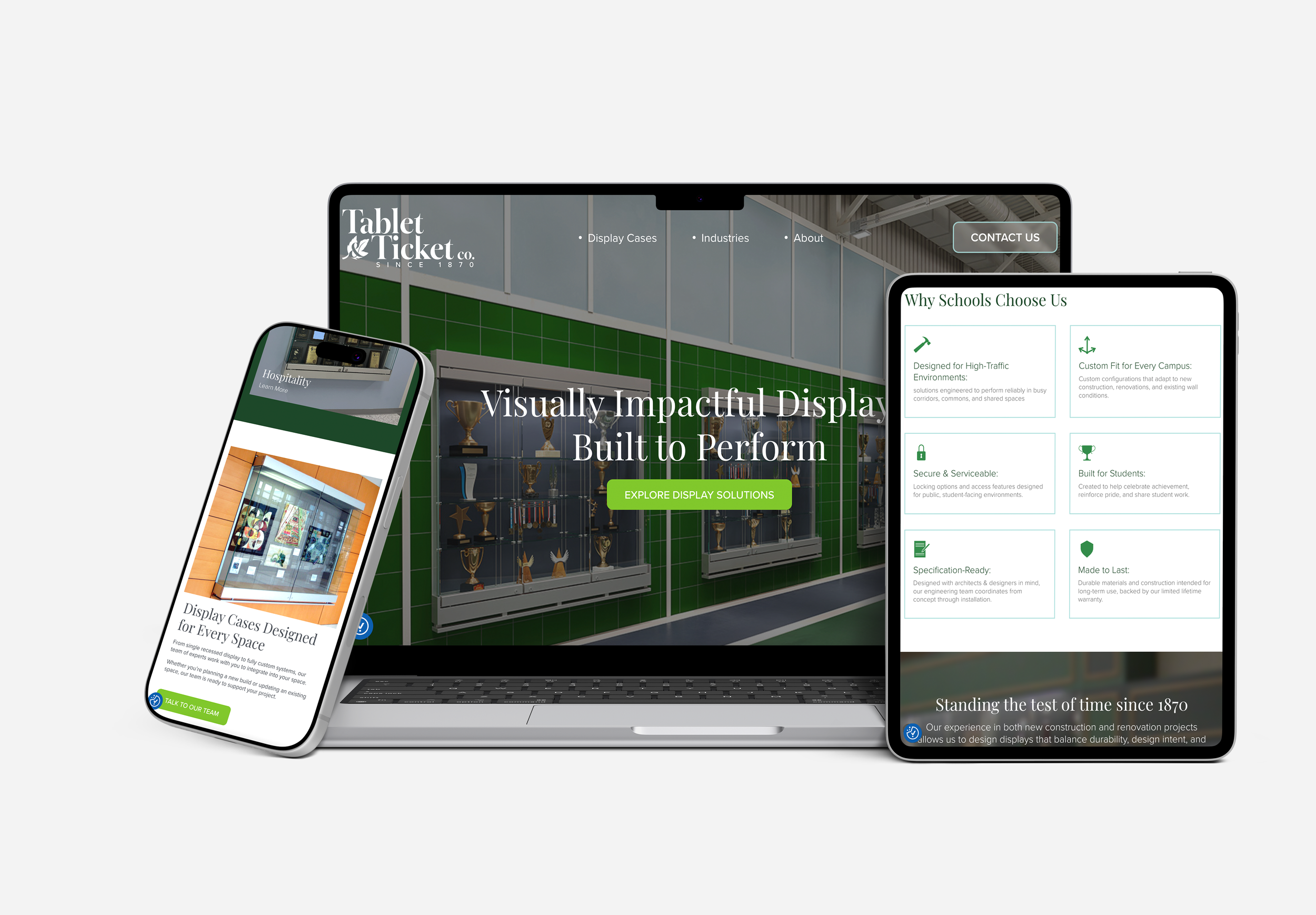
The website was developed in collaboration with CreativeFuse, aligning the digital experience with the updated brand direction.
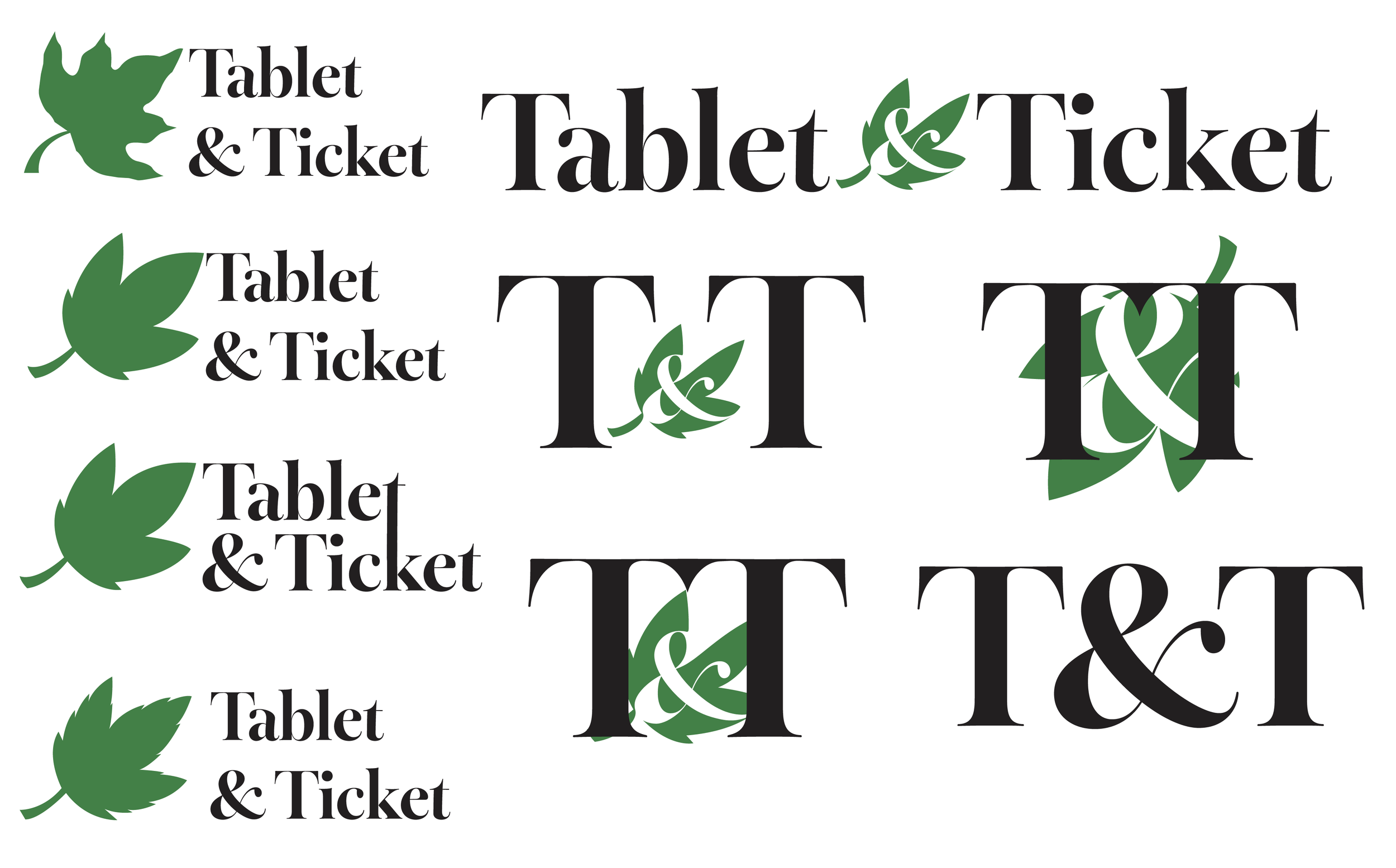
Sketches/Iterations
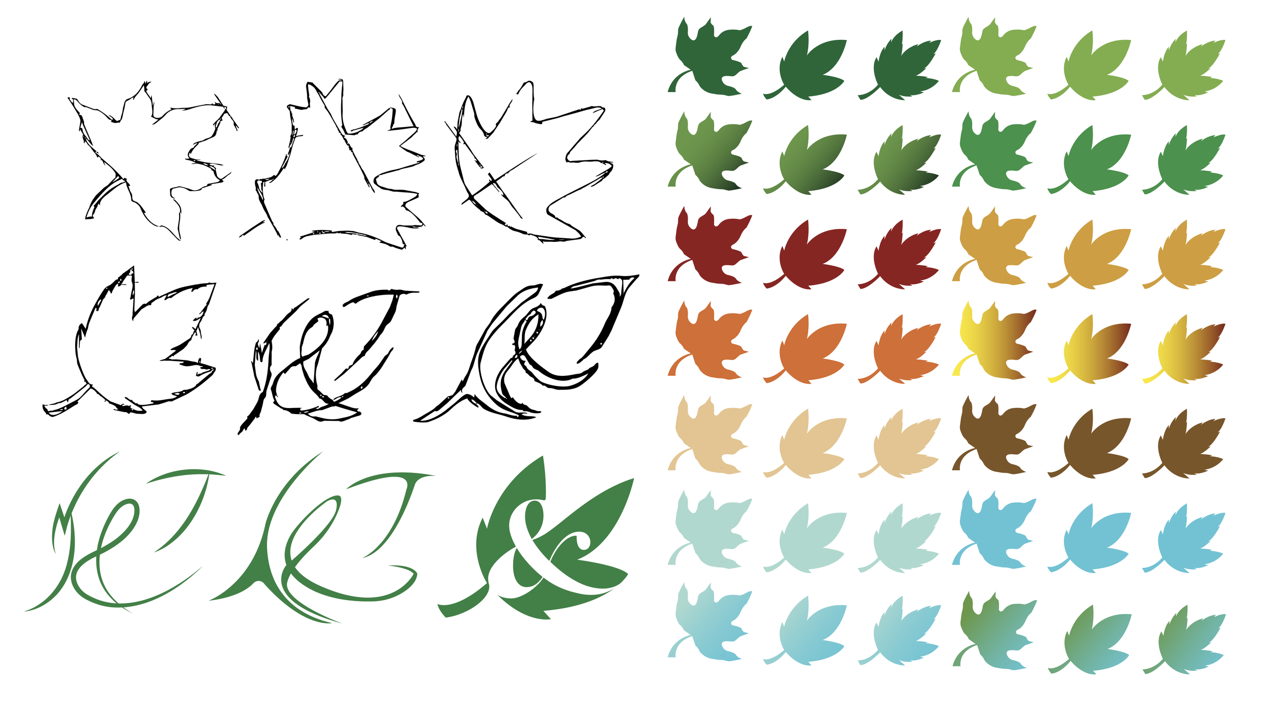
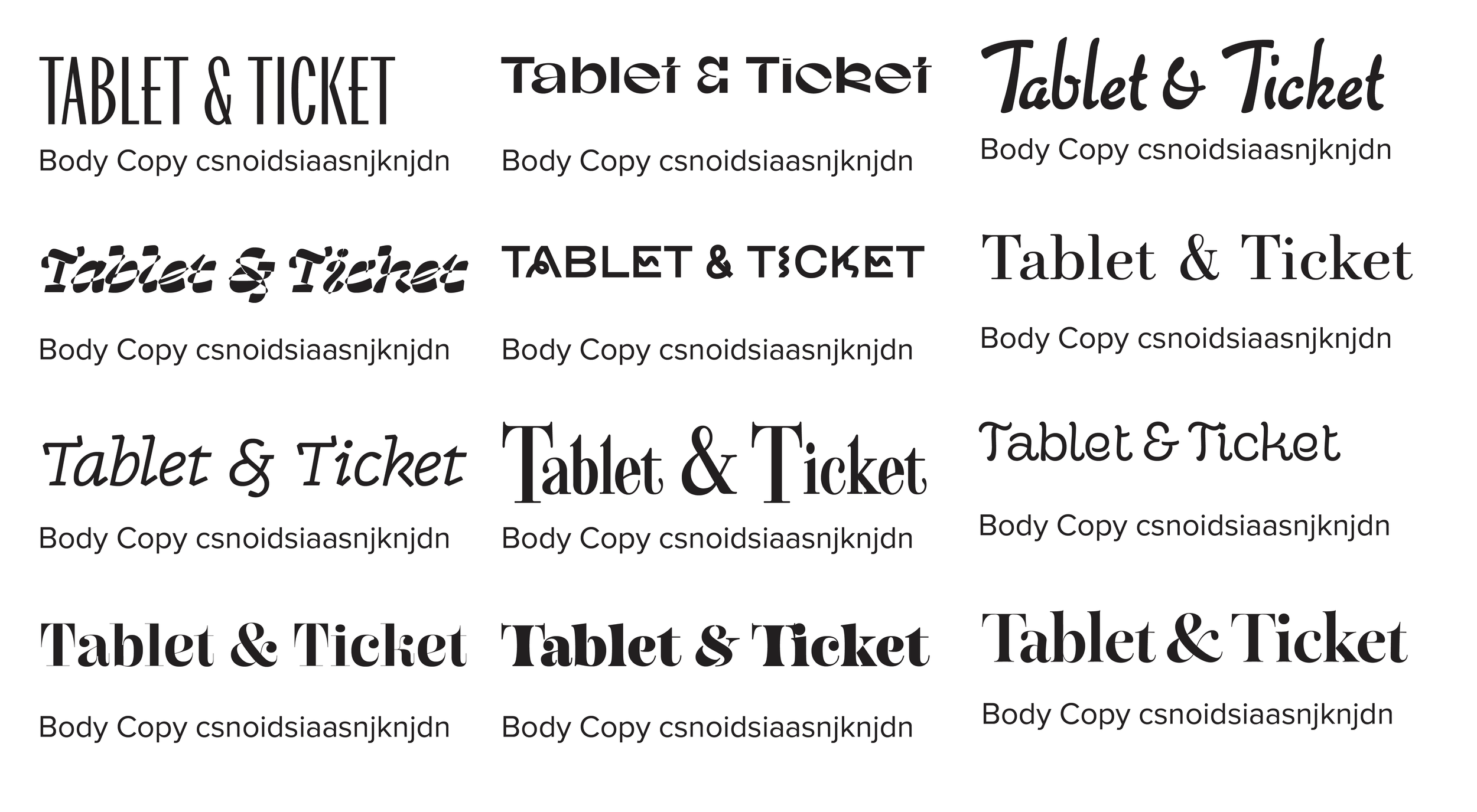
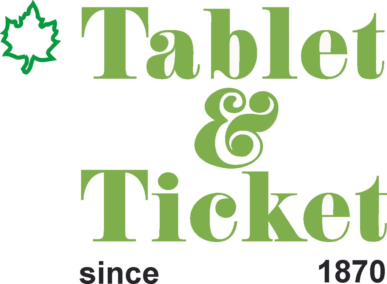
Final Version


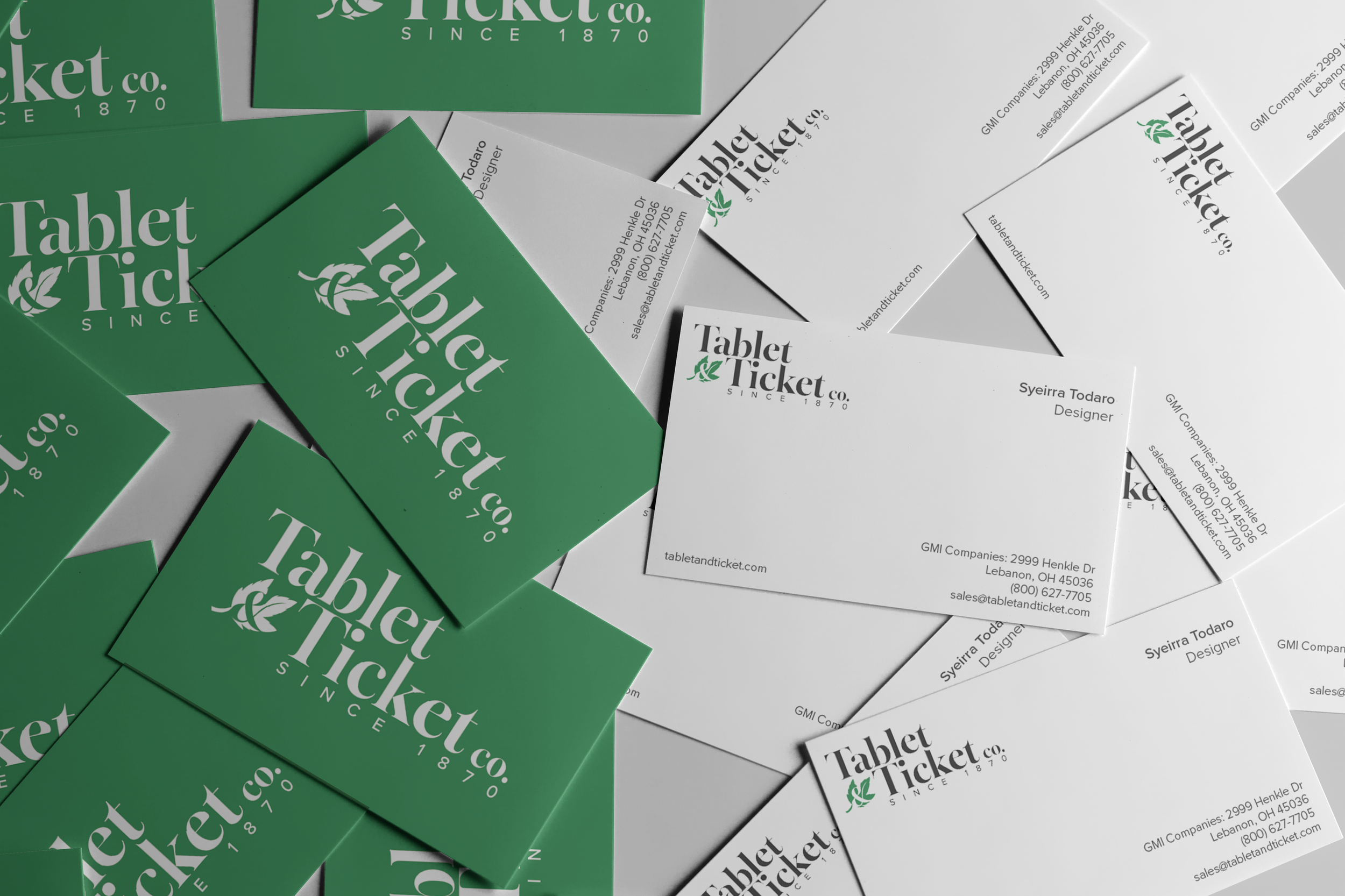


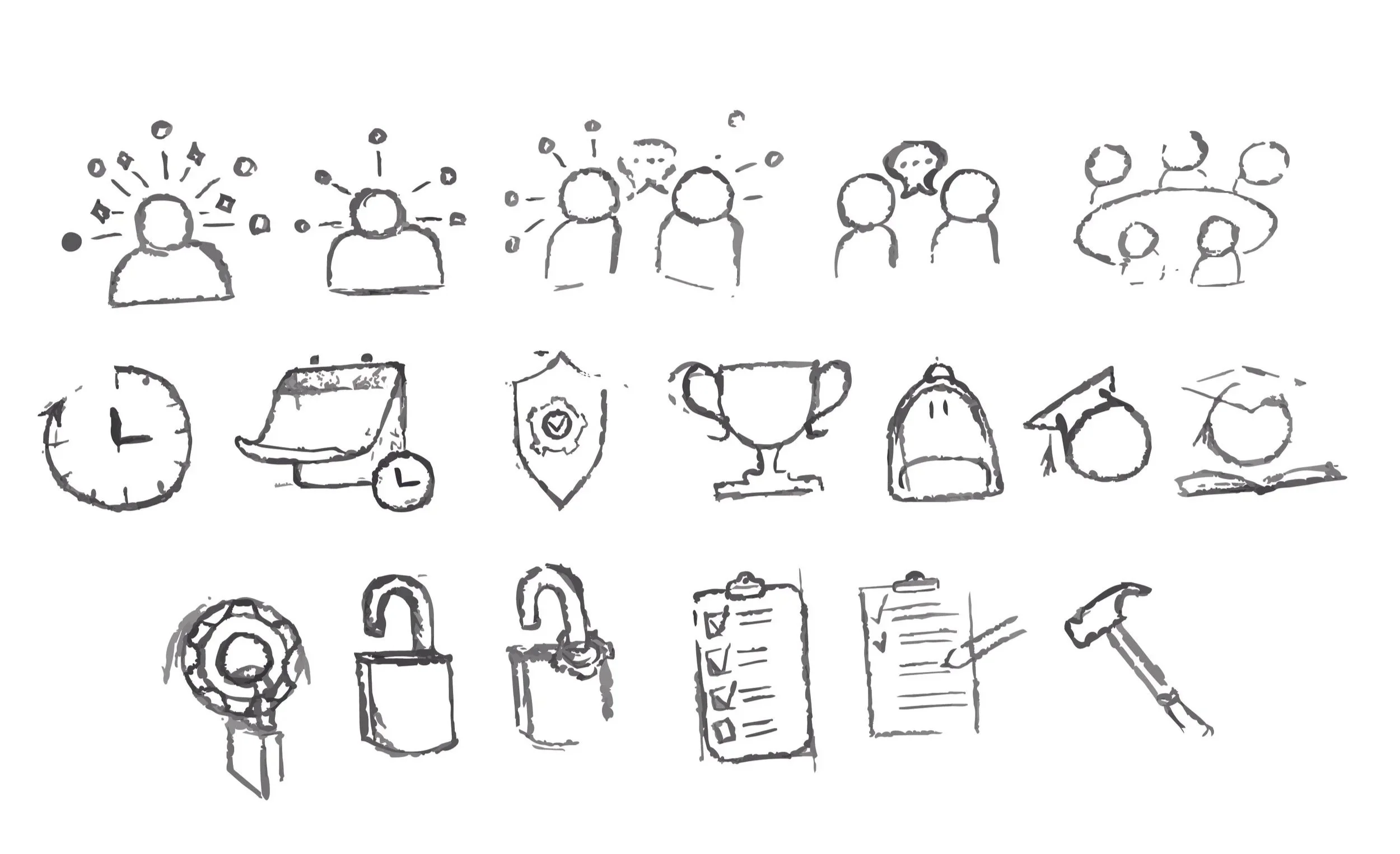
Additional Brand Elements
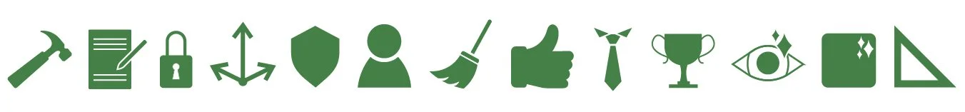
After the logo redesign was completed, I was asked to create a set of supporting icons for the new website. These icons were designed to complement the updated identity, using consistent line weight and visual language.